Inspiration, Tips and Advice
How to design with the Pantone Colour of the Year
Meet PANTONE 16-1546. Or, Living Coral, by its more casual moniker.
It’s everywhere. From the catwalks to our living rooms, this colour is seeping into 2019 like a tin of spilt paint. And we’re here for it.
Described as “vibrant, yet mellow PANTONE 16-1546 Living Coral embraces us with warmth and nourishment to provide comfort and buoyancy in our continually shifting environment.”
One thing’s for sure, it sure is bright – making ideal for livening up your winter collections or adding a dose of colour to your summer palettes.

How is the colour of the year chosen?
“A global team of color experts comb the world looking for new color influences,” said Laurie Pressman, vp of the Pantone Color Institute. “This can include the entertainment industry and films in production, traveling art collections and new artists, fashion, all areas of design, popular travel destinations, as well as new lifestyles, playstyles and socio-economic conditions. Influences may also stem from new technologies, materials, textures and effects that impact color, relevant social media platforms and even upcoming sporting events that capture worldwide attention.”
Want to get your hands on it?
If you’re thinking about using this shade in your upcoming collections, we’ve got some inspiration for you
Go bold
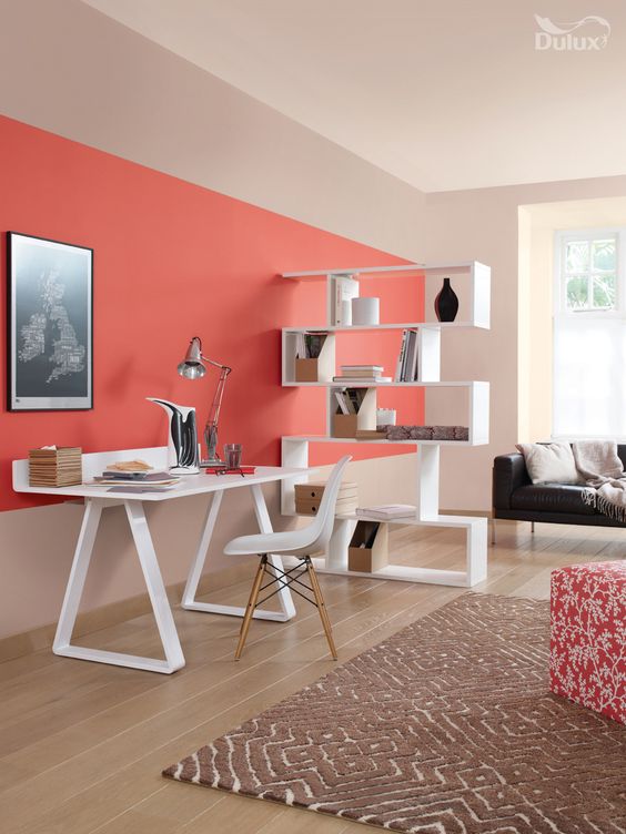
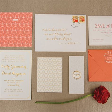
Coral loves bold block designs. One great thing about Living Coral is that it is unafraid and daring, so why not be unafraid and daring your designs? Go for a full coral colour block or team bold coral elements with geometric shapes for maximum impact.
Go ombre
If you’re not sure about going all-out with Living Coral, why not take a little inspiration from Jolie Carte and incorporate ombre within your designs? A little softer, a little more feminine, ombre is still ruling when it comes to trends, and the addition of Living Coral will only elevate the trend.
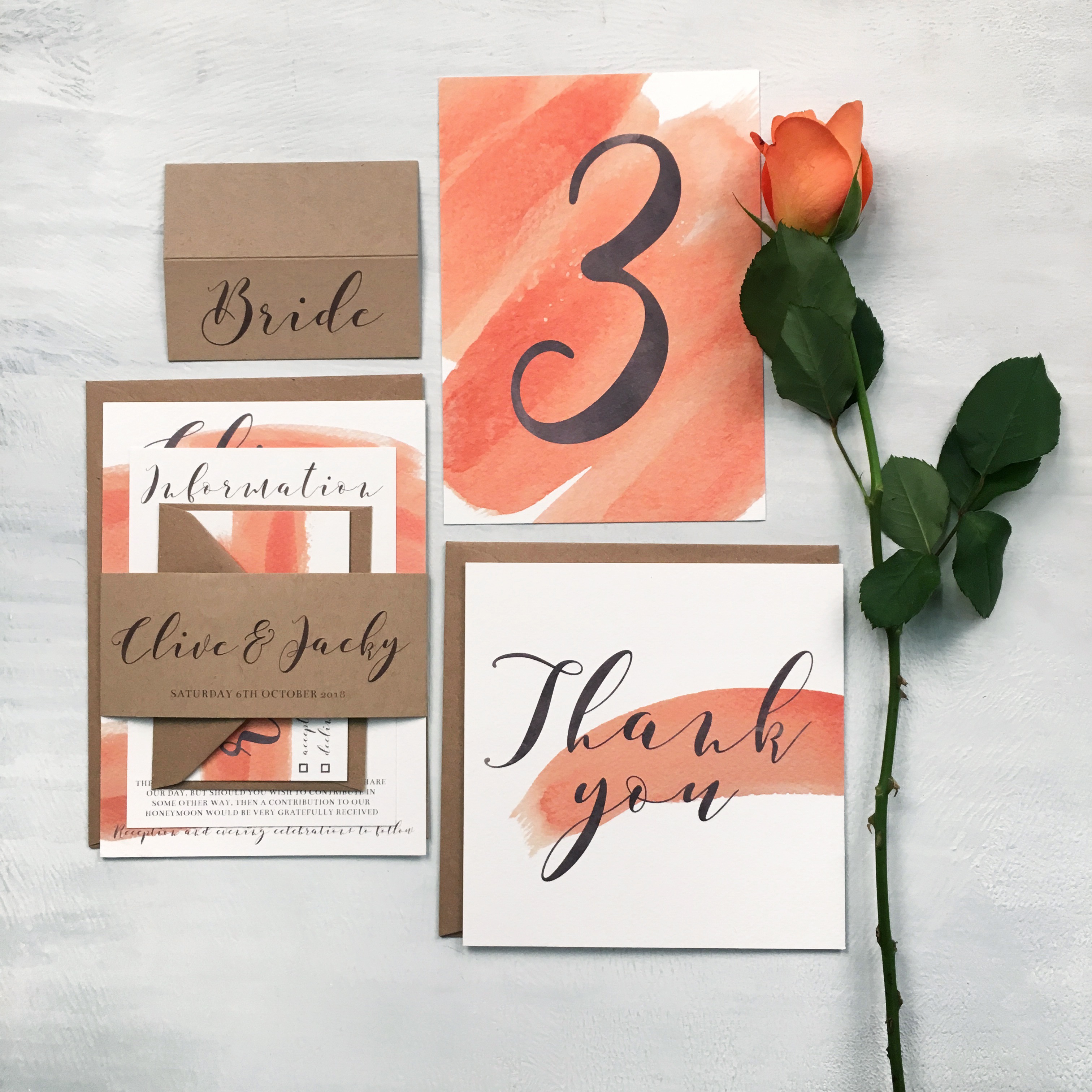
Add an accent
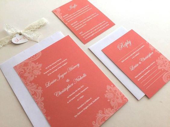
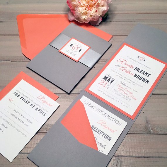
Living coral works great with other colours. It’s perfect for livening up grey shades, brightening blues and contrasting with pinks and greens for a summery bouquet feel. It’s bold enough to be used in small does without getting lost, but mellow enough not to overpower your designs.
Go patterned
Patterns are an easy way to bring this shade to life without fully committing to going completely coral. Patterns are still big for 2019 – combining them with coral can only be a double-whammy of on-trend success.

Comments are closed.